
Every week, Danielle (from Danielle’s Book Blog) and Cátia (from TheGirlWhoReadTooMuch) host a feature called Book Traveling Thursdays on Goodreads. They give you a topic each Thursday and you choose a book that you think fits. Then comes the fun part: a cover showdown! You post the original cover, the cover from your country (which I won’t be doing because the books aren’t published here), and then your favorite and least favorite cover from any edition around the world.
This week’s topic is a book you would want to read in a lazy day at home or the beach. For this I decided to go with And Then There Were None by Agatha Christie because it’s a classic of the mystery genre and it’s a very easy and entertaining read. Now, let’s check out the covers!
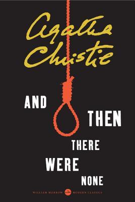
 ORIGINAL COVER

The book was first published in the UK in 1939 under a different title which contained the N word, so I don’t feel comfortable adding the actual original cover. Instead, I added the original 1940 cover from the US with the current title. I don’t like the skeleton hand because it makes it seem more like a horror novel than a mystery, but it’s not the worst I’ve seen.
FAVORITE COVERS

On the left is the Polish edition and my favorite, and on the right is another US edition. I like the simplicity of both covers, the creativity behind the Polish one and the colors of both, even though they are different. They were the ONLY ones that I liked among the many many covers this novel has. There were so many bad ones for this book! None of the others truly represented the story as I wanted them to, except these two.
LEAST FAVORITE COVERS


As a consequence of the original title, many of the covers took an offensive or problematic turn. I decided to ignore those types of cover because I don’t feel comfortable sharing them here, even though I consider those to be my least favorites. Instead I chose terrible covers design-wise. On the left we have the Portuguese edition. It’s so bland. It doesn’t even say mystery, it says boring. On the center is the Thai edition. If you don’t know this novel, at first glance you might think it is a children’s book. Then you notice the noose around his neck and everything changes. The illustration is too childish for the subject at hand! Finally on the right is the Arabic edition. I don’t like the illustration nor the decision to include Death as part of it and the colors are so bad!

Portuguese cover looks like a child’s book gone horribly wrong…
LikeLiked by 1 person
Hahah that’s a great way to describe it!
LikeLiked by 1 person
For some reason all the Agatha Christie books here in Portugal have that style of cover. The good thing is that almost everyone that reads know who Agatha Christie is and what type of books she wrote so we know it’s a mystery… even if it doesn’t look like it XD At least all of her books match 😛
LikeLiked by 1 person
At least is not so bad, it’s just not very creative! But I’m glad they match 😀
LikeLiked by 1 person
Yeah. At least something bad came from those covers
LikeLike
I first read And Then There Were None as a young teenager (20+yrs ago) and I’ve always loved it. Until today I had NO idea it once had a terrible title, thanks for the book knowledge! And I agree with you on the Polish cover being the best.
LikeLiked by 1 person
It’s a pretty fun book 🙂 And I only came to know of that writing this post, it was an interesting fact and I’m glad it got changed pretty quickly.
LikeLike
that Polish cover is sooo good and so thoughtful!
I definitely agree with all your choices ☺
LikeLiked by 1 person
😀 I’m glad, I thought so too!
LikeLiked by 1 person
I never thought to look at book covers in other cultures (except Harry Potter). Sometimes we see covers change when a book becomes a movie, and they put the actors on the cover, but normally you don’t see many different covers side by side. Thanks for pointing this out. Really unique post.
LikeLiked by 1 person
It’s a really fun feature Danielle and Catia created. I love seeing other people’s posts and their choices 🙂
LikeLike
I was about to write…”eh, we all know what the original cover said, no need to bring it up again,” but then I read the comments. 🙂 I still can’t see any reason to highlight them though, unless you’re doing a post about the title. Anyway, this book has always had terrible covers. But I like the Polish one! That is pretty neat.
This is a fun feature that I haven’t come across before. Hm, what do I want to read? Probably a cozy mystery too!
LikeLiked by 1 person
Yeah, you’re right. That’s why I decided against it, it’s now worth it here. I love doing Book Traveling Thursdays because it’s just plain fun seeing beautiful and terrible covers from across the world. I love seeing the difference in the art choices.
LikeLike
I think it’s your post, so you decide, and it’s probably best to avoid the truly terrible covers from the original edition. That Thai edition, though. Creepiest children’s book ever, that’s what it says.
LikeLiked by 1 person
Thanks you, yes, I ultimately thought that was the best. And I know, right? What were they thinking?
LikeLiked by 1 person
I reeeally like the Polish edition. SO PRETTY. And kind of subtly creep too. And omg what is that Thai edition?!? Nopity no to that one. XD
Thanks for stopping by @ Paper Fury!
LikeLiked by 1 person
Right? One got it SO right, and the other one SO wrong lol.
Thank YOU for stopping by 😉
LikeLike